A few weeks ago, I read this piece on cost disease from SSC, and it got me thinking. The question is simple: why are costs of certain things, most notably education and healthcare, skyrocketing so quickly, with relatively little improvement in quality?
The SSC piece discusses the problem in general and brings up lots of interesting stuff, but it overlooks a key piece of the puzzle: there are really two questions here. One question is purely an accounting question: costs keep rising faster than inflation, so where is all that extra money going? The second is an economics question: knowing where all the money’s going, why is so much money going there? A complete answer should address both questions.
Here, I’m going to focus on college costs, especially for 4-year private nonprofit colleges.
Part 1: Accounting
College costs keep rising, so where is all that money going? The nice thing about this question is that it’s very simple to answer, in principle. For any particular college, if you had access to the books, you could simply look through all the expenditures, add it up, and see how expenditures changed over the years.
I don’t know of any college which puts its books on the internet for all to see going back to the ‘60’s. (If you do have access to the books for any particular college and would be willing to let me run this analysis on them, please let me know!) But there is the National Center for Education Statistics, which compiles some high-level accounting data on all colleges in the US, and publishes an annual digest.
Let’s start at the beginning: what’s the cost of college, by year?

Source here. This is undergraduate tuition & required fees at 4-year colleges. Data separating private nonprofit/for-profit only goes back to 1999, because enrollment in for-profit colleges was negligible prior to the late ‘90’s. Note that all costs in this post, both in the graphs and the discussion, are adjusted to 2013 dollars.
From here on out we’re going to focus only on private, nonprofit 4-year colleges from 1999 to 2013, because that’s what the Digest of Education Statistics has data on. (Again, if anyone can find good data back to the ‘60’s, please let me know!)
We’re going to follow the money on its journey.
From tuition, comes revenue for colleges. Let’s make sure the payments arrive safe and sound…

(Source; FTE = full-time enrolled student; all graphs from here on out show inflation-adjusted costs per FTE per year unless otherwise specified.)
Well that’s informative! If you’ve been to a private 4-year nonprofit university lately, you probably noticed that most people don’t actually pay the sticker cost. This data makes it pretty clear: actual expenditure on tuition is a lot lower than the sticker cost suggests. More to the point, nominal tuition grows much faster than actual tuition revenue. From 1999 to 2013, nominal tuition grew by 42.0% (about 3% per year), whereas tuition revenue grew by 23.7% (about 1.7% per year).
So roughly half the supposed growth in private college cost comes just from the games colleges play with their sticker-price tuition. If we look at what students actually pay - what colleges actually receive in tuition revenue - growth is lower by a factor of two.
But we’re not done yet! Remember, these numbers are all inflation-adjusted, so the remaining 1.7% annual growth is still 1.7% on top of inflation. So, we still want to know why college costs are growing faster than inflation.
Before we move on to expenses, a little more on revenue. Tuition revenue is less than half the revenue of private nonprofit colleges. Most of the rest comes from a combination of federal/state grants, private gifts, and investments. Key facts:
- Grants and gifts cover the lion’s share of non-investment revenue, but they’re roughly flat from 1999-2013.
- Investment revenue is very noisy, and colleges mostly don’t rely on their portfolios to cover costs.
- Other than a rise in profits from hospitals, tuition was the only category of revenue to grow significantly and steadily.
I don’t want too much data-clutter, so the relevant graphs are at the end of the post. The important takeaway here is that, even though tuition is less than half of colleges’ revenue, it absorbs pretty much all of the growth in expenses.
With all that in mind, let’s look at non-investment revenue compared to expenditures.

That’s comforting: non-investment revenue is pretty close to expenditures. (Source) This is a good justification for ignoring investment revenue. As expected, both non-investment revenue and expenditures are growing steadily.
Now, how do all those expenditures break down?
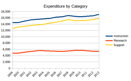
Again, everything is per FTE per year. So support cost (student services, academic and institutional support) is roughly comparable to instruction cost (teaching), and the two have risen at similar rates in the 1999-2013 window. Research expenditures, meanwhile, have been pretty flat.
Between them, support and instruction expenditures added about $5800 per FTE during this period, while (actual) tuition only increased by about $3900. What about the other $2000? About $1000 of it came from cutting expenses in public service, grant-based financial aid, and other costs. Another $1000 came from net profit in university-owned hospitals, which became quite profitable during this period.
So colleges really have been tightening their belts, cutting back on things like public service and grant-based financial aid, making money off their hospitals… and all the money from that belt-tightening, along with tuition increases, has gone back into paying professors and staff.
Let’s keep following the money. Next stop, professors and staff. Why are costs for instruction and support increasing faster than inflation, year after year?
Well, as the professors will tell you, it’s not their salaries. Inflation-adjusted average instructor salaries rose from $81500 to $87000 over the period (source). Full professor salaries rose a bit more, and were offset by dramatically increasing numbers of graduate assistants and associate professors and whatnot. Bottom line, average inflation-adjusted salaries increased, but not enough to account for the growth in expenditure.
The bigger factor was a decrease in student-faculty ratio. The Digest only gives numbers for 1993, 2003, and 2013, but from 2003 to 2013, the student-professor ratio dropped from 11.9 to 10.6 at private nonprofit colleges. That’s a 12% increase in professors per student. Combined with the 7% increase in salary, that’s just about right to account for the 18% increase in instruction costs.
The data in the digest does not provide a clear story about the increase in support expenditure; it doesn’t have much information on non-instructional staff other than the expenditures. Based on the data for instructional cost, we can speculate that the picture is similar: a moderate increase in salaries beyond inflation, combined with growth in support staff per student. Just a hypothesis for now, but it seems like a pretty plausible guess.
Summary
We started with the sticker price of tuition, and immediately saw that sticker price is much larger and grows much faster than the actual tuition revenue per student (at least at private 4-year nonprofit colleges/universities). So a big part of the growth of cost in college is that colleges play games with the sticker price, which doesn’t really reflect the actual tuition paid. But that only accounts for half the inflation-adjusted growth, so we have to keep looking.
Next, we followed the money: from tuition and other revenue to overall expenditures to expenditures by category and finally to student-faculty ratio, which is the main driver of cost growth over this period (along with its support-staff equivalent).
Unfortunately, the relevant revenue and expenditures data from the Digest only goes back to 1999, whereas rapid growth in college prices started around 1980. Were student-faculty and student-staff ratios the main source of cost increases all along? I expect the answer is yes, although this data set doesn’t go back far enough to check. One quick sanity check for law schools in particular is provided by the Bar Association:
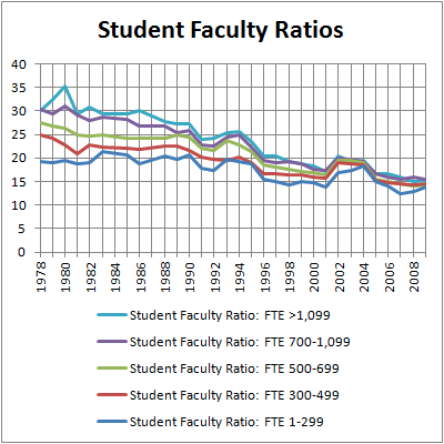
(Source). Sure enough, student faculty ratios at law schools have fallen steadily since the early ‘80’s, by a factor of 2 for the largest schools. So it’s quite plausible that student-faculty ratios have been the main source of cost increase all along.
In fact, I suspect that the increase in faculty per student is also a big driver of the increase in faculty salaries, since the extra demand will drive up wages… but that’s a topic for the next post.
More generally, where this post was about the accounting questions behind college costs, the next will be about economic questions. This post asked “where?”, “what?”, and “how?”; next post will ask “why?”. Why did student-faculty ratios fall? Why are students willing to pay so much? Why did sticker prices become disconnected from actual costs?
Update: Actually, the next post is a little more accounting. But it's getting closer to the economics questions.
Appendix: Stray graphs
All sources for these graphs were linked above. All costs are per FTE per year, for private nonprofit 4-year institutions, adjusted for inflation.

Investments: large and noisy, but mostly just keep to themselves.

All the other revenue sources. Note that tuition and hospital revenues are the only categories to show consistent growth.
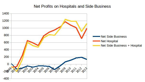 Profits from university hospitals increased from zero to about $1000 per FTE.

Slightly more granular support expenditures.
No comments:
Post a Comment